Beyond the Wall of Sleep
Movie: Beyond the Wall of Sleep (2006)
Watched with: John and Angelo.
I haven't written about last night's movies yet, but I'm pissed off enough about this one now that I need to get it out of my system.
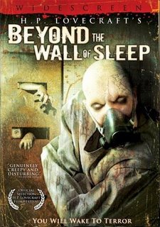
John made Angelo rent this while I was at work, and when I got off they brought it over. John thought it would be a good movie because they slapped HP Lovecraft's name on the front and he thought the cover looked cool.
The cover looked like this:

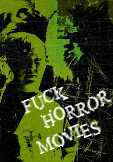
I pointed out that, aside from having a straight jacket and gas mask, the look of this cover was very unimpressive. To illustrate this, I made my own, out of a picture of me and of a cat we used to have.
My cover looked like this:

And this movie is so much worse than even its mediocre cover suggests.
In a normal movie, if your cinematography, lighting, acting, editing, script, sound mix and everything are abysmal, you try to fix them. But in a low budget horror movie, you can claim that's part of the TERRIFYING HORROR.
This was badly shot in kind of a faux-Blair Witch style, with ugly high contrast lighting, sub-high school drama acting, jumpy headache-enducing editing, awful dialogue (not even good in that verbose Lovecraft way) and...I don't particularly remember the sound, but I'm sure it was bad.
If your movie's mise-en-scene is "shittiness", you're not scary.
You're just shitty.
Every time I go to a screening of student films, I wonder about the people who's movies are incompetent even after years of schooling.
"Do these people really think they can work in the industry?" I wonder.
Apparently, the answer is yes.
They grow up to be Barrett J. Leigh and Thom Maurer.
"Thom"?
Fuck these guys.
Watched with: John and Angelo.
I haven't written about last night's movies yet, but I'm pissed off enough about this one now that I need to get it out of my system.
John made Angelo rent this while I was at work, and when I got off they brought it over. John thought it would be a good movie because they slapped HP Lovecraft's name on the front and he thought the cover looked cool.
The cover looked like this:

I pointed out that, aside from having a straight jacket and gas mask, the look of this cover was very unimpressive. To illustrate this, I made my own, out of a picture of me and of a cat we used to have.
My cover looked like this:

And this movie is so much worse than even its mediocre cover suggests.
In a normal movie, if your cinematography, lighting, acting, editing, script, sound mix and everything are abysmal, you try to fix them. But in a low budget horror movie, you can claim that's part of the TERRIFYING HORROR.
This was badly shot in kind of a faux-Blair Witch style, with ugly high contrast lighting, sub-high school drama acting, jumpy headache-enducing editing, awful dialogue (not even good in that verbose Lovecraft way) and...I don't particularly remember the sound, but I'm sure it was bad.
If your movie's mise-en-scene is "shittiness", you're not scary.
You're just shitty.
Every time I go to a screening of student films, I wonder about the people who's movies are incompetent even after years of schooling.
"Do these people really think they can work in the industry?" I wonder.
Apparently, the answer is yes.
They grow up to be Barrett J. Leigh and Thom Maurer.
"Thom"?
Fuck these guys.


0 Comments:
Post a Comment
<< Home